Digital Tools vs. Tinting on-site for business initiatives
Color decisions in commercial painting live at the crossroads of design, logistics, and chemistry. A hotel corridor with warm neutrals, a warehouse with safety demarcations, a retail rollout with a branded palette across dozens of sites, they all rely on predictable color. The tension today sits between two approaches to getting there. On one side, digital tools promise accuracy, speed, and repeatability from the design studio to the jobsite. On the other, on-site tinting offers flexibility and real-world adaptation, especially when existing substrates, light, and schedule constraints push against lab-perfect formulas.
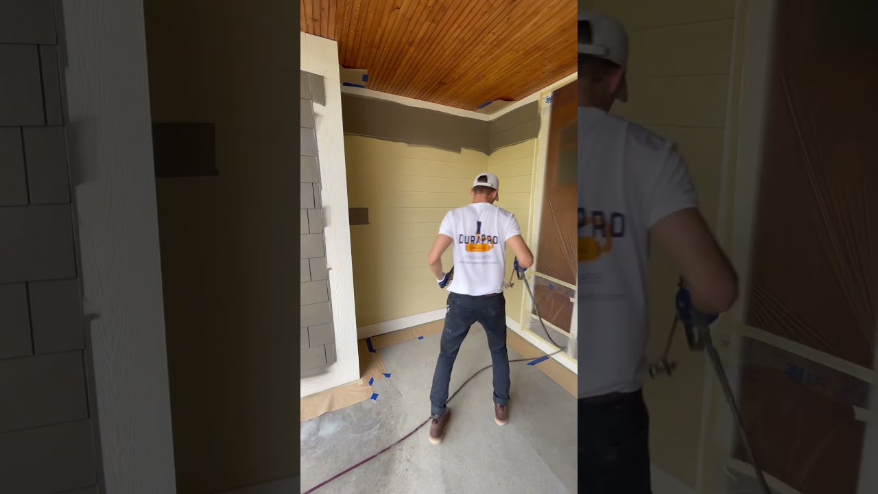
Commercial painters in Dallas, TX navigate this decision daily. The region’s strong sunlight, day-night temperature swings, and a broad mix of building types demand both discipline and improvisation. When color must be right the first time over large square footage, you cannot choose tools or workflows based on novelty. You choose based on risk, control, and what the project will tolerate.
Why color behaves differently on commercial projects
A residential repaint might involve a few rooms and a handful of gallons. Commercial sites move at another scale. A single distribution center can take 600 to 1,200 gallons across primers, topcoats, and specialty coatings. A healthcare or education campus can span phases over months, with products that must match perfectly long after the first area has cured. That scale magnifies tiny color differences. A delta E of 1 or 2, often invisible on a sample card, becomes obvious across a 300-foot wall or under high-CRI LED fixtures.
Lighting is the second force that shapes color on commercial jobs. Showrooms and offices use LEDs with specific color temperatures. Parking garages lean cooler to punch through shadows. Retail chains specify lamp types and lumen packages to keep stores on brand. A digital match pulled from a fan deck can drift in unexpected ways under those conditions. Even a formula that looks perfect outdoors at noon can skew green or muddy under 4000K LEDs with a particular spectral spike.
Finally, substrates and sheens complicate things. Bare tilt-wall concrete absorbs differently than level-5 drywall. Old stucco has texture that scatters light. Epoxy coatings in warehouses have gloss levels that accent every variation. The same formula in flat, eggshell, and semi-gloss will read differently. All of this determines whether digital tools alone can carry the day or whether on-site tinting has to join the process.
What digital tools really do
Digital tools cover a spectrum. Some live on the design side, some in the paint store, others in the field. Each has strengths and blind spots.
Colorimeters and spectrophotometers sit at the heart of modern matching. A good handheld unit measures reflectance across multiple wavelengths, then suggests a near match from a known library or generates a custom formula. The promise is simple, yet the accuracy depends on surface prep and the instrument’s calibration. Gloss throws off readings. Texture scatters light. Dust and film on a sample skew results. Experienced crews wipe, degloss, or even cut a small chip from a representative area, then measure on a smooth, neutral backing.
Formulation software in paint stores and distribution centers builds on those measurements. It compensates for tinting strength, base selection, and VOC limits. On large orders, the software also handles batch scaling so that 1,000 gallons match within a tight tolerance. When a project uses several sheens, the system can adjust for the way light interacts with those films. If you need 200 gallons today and 200 more in three weeks, the software anchors the color to a base formula so you do not drift over time.
Fan decks and digital swatches remain helpful, but they can mislead when used in isolation. Paper stock, ink processes, and viewing conditions do not mirror paint films. The better use is as a starting language, especially in preconstruction. Designers and owners point to a deck color, then the project team translates that intent into actual paint systems, including primer choice and sheen. When in doubt, large drawdowns and jobsite sample panels settle arguments faster than any pdf.
Mobile apps tie things together. A superintendent can log approved colors, lot numbers, and formulas, then tag progress photos by room or area. That record matters when a change order hits late in the project or when a facilities team calls two years later asking for the lobby accent color. Apps also sync with store databases so reorders match prior batches.
Used well, digital tools enhance predictability. They let a team produce the same warm gray across five clinics and three office floors without reinventing the wheel each time. They are ideal for long-run work where deviation has a high cost, like corporate branding, healthcare corridors, and multifamily exteriors with HOA oversight.
Where on-site tinting earns its keep
On-site tinting can mean anything from a few drops to shift a five-gallon pail to a dedicated tinting rig on a large project. The best argument for it is reality. Surfaces are never as clean as the lab. Light changes during the day. Old coatings telegraph through new ones. Touchups happen in the last 10 percent of the job when owners walk the space and see with fresh eyes.
A simple case from a retail project near the North Dallas tollway: a brand-specified beige read slightly pink under the store’s LEDs. We ran two panels, one with the formula and one with a tiny nudge of green oxide. The adjusted panel lost the pink cast without breaking the brand look. That was a five-minute on-site decision and saved a day of back-and-forth with the store’s architect.
Another example from a hospital expansion: the designer selected a calming blue. On the wall adjacent to windows with low-E coatings, the blue went cold and institutional. We warmed the formula on site by easing in a hair of raw umber. The shift measured small on a spectro, but human eyes under that glass saw a big difference. That decision also prevented a chain reaction, since signage and flooring had been chosen to complement the intended hue, not the cold version.
On-site tinting is also useful when blending batches near the end of a run. If the team is down to the last two rooms and the store’s rush batch reads a notch off against a wall already finished, a skilled foreman can tone the new pail to meet the field condition rather than the theoretical standard. That practice should be controlled, logged, and limited to final areas, but it saves unnecessary repaints.
The most common tools commercial painters use for color control
The toolbox gets ignored until a mismatch burns a day’s labor. The gear that keeps color honest tends to be modest in cost compared to the schedule risk it avoids.
- Handheld spectrophotometer or colorimeter calibrated to the manufacturer’s standard.
- Drawdown cards and a small roller frame to produce test panels with actual project paint.
- Portable light kit with adjustable color temperature for evaluating samples on site.
- Precision digital scale and graduated syringes for micro-tinting small batches consistently.
- Clean mixing equipment, including paddle mixers, sealed containers, and a drill with variable speed.
With those five items, a field team can quickly validate formulas, simulate lighting conditions, and make controlled adjustments. The scale and syringes are the unsung heroes. Guessing at “a splash” of tint is how you end up with one hallway warmer than the next.
Contracts shape the color process
Color is not only an aesthetic decision. It is also a contract item with allocation of risk. Commercial painters contracts vary by client type and region, but a few clauses consistently affect color control. Submittals usually include fan deck references, wet samples, and sometimes 24 by 24 inch drawdowns. The approval language matters. If the spec says “match designer-approved sample under project lighting,” the general contractor and the painter both have leverage to insist on on-site verification before high production.
Mockups reduce disputes. A painted mockup at scale, ideally placed in an area with representative light, allows the owner to see the final effect. That mockup becomes the control sample for the rest of the job. If a later batch appears off, the painter can measure against the mockup and the store’s batch control to identify the source. Without that reference, color arguments become subjective.
Touchup language is another driver. Some contracts treat touchups as part of the base scope. Others convert extensive touchups to a change order if they arise from late design changes or owner-furnished fixtures that shift perceived color. Lighting submittal coordination also plays a role. If light fixture type or color temperature changes after paint approvals, a color shift should not sit solely on the painter’s shoulders.
Finally, recordkeeping matters. Lot numbers, base numbers, tint formulas, and the specific store location where the paint was mixed should be recorded in daily reports. A chain grocer in Dallas once had three stores open within weeks of each other, all using the same warm white. One store read slightly more yellow. The logs traced it to the base selection at a branch that substituted a deep base where a medium base had been specified. Because it was documented, the correction got paid and the store opened on time.
Safety and practical realities
The focus is often on aesthetics, but the daily reality for crews is safety and workflow. Protection gear commercial painters wear has improved, and color decisions often happen while standing on lifts or near active trades. The standard kit includes respirators appropriate to the product’s VOC profile, safety glasses, cut-resistant gloves for tool handling, and high-visibility vests in active areas. In Texas heat, breathable PPE and hydration plans are not optional. On exterior tinting days, heat can complicate testing because high temperatures speed solvent evaporation, which shifts how color appears during the short open time. Experienced foremen account for that by viewing panels after full cure, not just after flash-off.
The jobsite environment also changes how digital tools are used. Spectrophotometers prefer stable conditions and clean samples. On a dusty remodel, it pays to set up a small “color station” away from traffic with a folding table, shade, and a power strip. There, the team can make adjustments and evaluate drawdowns without drywall dust and concrete fines contaminating the mix.
Dallas-specific variables
Commercial painters in Dallas, TX deal with heat, UV exposure, and that particular intensity of sun that makes even subtle undertones more pronounced. Exterior projects along Stemmons or in Las Colinas need fade-resistant pigments if the owner expects the same look two summers from now. Organic pigments that look beautiful on a sample can chalk out fast on an unshaded south facade. Digital formulas need to translate into paint lines that use lightfast, exterior-grade colorants. When an architect brings a coastal palette heavy on clean blues and greens, it is wise to discuss pigment durability up front.
Interior projects see their own Dallas quirks. Many offices run cooler LED color temperatures to keep spaces crisp. Against that light, grays with a red undertone can look dingy. When reviewing digital swatches, bring a portable light set to the building’s planned CCT and CRI, then walk samples through multiple areas. A color that sings in a lobby with daylight may die in a conference room with no windows. On-site tinting lets you thread that needle, especially on large floor plates where lighting varies by zone.
Digital strength: repetition across sites
Multi-site rollouts, whether for medical clinics, coffee chains, or logistics offices, reward the discipline of digital tools. Once a palette is approved with physical drawdowns and mockups, a paint manufacturer can lock the color into its system. Orders can then be fulfilled across the Metroplex with batch consistency that on-site tinting cannot rival at scale. The winning move is to set a standard operating procedure: same product line, same base, same sheen, clear formula naming, clear submittal photos, and a kickoff sample panel at each site to verify under local lighting.
In those programs, on-site tinting still plays a part but in a narrow lane. It is for final blending or small perceptual corrections, not wholesale color creation. You want the Dallas clinic and the Frisco clinic to look like siblings, not cousins.
On-site advantage: legacy buildings and unforeseen conditions
Where on-site tinting carries the day is in renovation. In older buildings throughout Deep Ellum or the Design District, walls carry stories. Layers of previous coatings, repairs, and texture patches mean that perfect digital matches on paper fail in place. You might be tying into an existing accent that no one can identify. A field spectro gives you a starting point. Then the crew leans on drawdowns and micro-tints to nail the blend.
The same goes for industrial floors or safety striping. The standard yellow may look correct under the facility’s sodium lights but shift green under new LEDs after a relight project. If production cannot stop for another respray, the painter adjusts on site, documents the shift, and coordinates with maintenance for future touchups. Digital formulas provide the backbone. On-site tinting delivers the last mile.
Managing sheen and perceived color
Many color disputes are actually sheen disputes. A semi-gloss reflects more of the environment, pulling in adjacent colors and intensifying the hue. A flat scatters light and softens the same color. Digital matching often anchors to a single sheen, but commercial projects rarely do. Offices ask for eggshell in corridors, satin on doors and frames, and flat in open ceilings. That trifecta will not read the same even if formulas match on paper.
The fix is procedural. Build a set of sample panels for each sheen, ideally from the same batch of base paint and tints. Review them under the intended lighting. If the satin pops too much, shift the color in that sheen only, keeping the overall palette intact. Record each variation as a distinct control sample with its own code. Crews then pull from the right stack when loading pumps and sprayers. That small bit of rigor prevents the late-night panic of realizing the door frames look like a different color in daylight.
Where mistakes happen, and how to avoid them
The worst https://www.paintersdallastx.com/commercial-painting-dallas-tx problems are rarely exotic. They come from speed and assumptions. Someone assumes the base is the same across product lines. Someone assumes the lighting spec will not change after paint approvals. A crew assumes a touchup will dry down to the same color as a wall painted three days earlier under different humidity. One avoidable headache involved a training center in Plano where a subtle green accent looked perfect in test rooms. On production day, a different primer was used on several walls. The topcoat looked cooler on those surfaces. A digital tool caught the difference, but only after two rooms were done.
Disciplined habits cut risk. Label each pail with room or zone. Keep a couple of gallons of each color for measured touchups after punch lists. Do not swap bases. Do not mix brands within a color family unless the manufacturer has verified cross-line formulas. If the store substitutes a deep base for a medium base due to stock issues, stop and recalibrate with fresh drawdowns.
Budget, schedule, and the cost of getting color wrong
Repaints are always more expensive than they look on paper. The direct costs are obvious: labor for a second coat, more paint, lost time. The indirect costs are worse. Missed inspections, rescheduled trades, liquidated damages if you hold up turnover. A 10,000 square foot office floor miscolored by one notch can cost two or three days to correct. At commercial rates in Dallas, that can mean tens of thousands of dollars, not counting reputation damage.
Digital tools reduce the rate of surprises. On-site tinting reduces the impact when surprises appear anyway. Treat them as complementary, not competing. The team with both skills resolves color faster and with fewer meetings.
A sensible workflow that blends both approaches
From preconstruction to punch, a hybrid approach keeps color smooth.
- Use spectro-based matching and manufacturer formulation for baseline accuracy, then confirm with physical drawdowns under project lighting.
- Lock formulas, bases, and sheens into submittals and contract records, with a physical mockup designated as the control sample.
- Establish a field color station with scales, syringes, and a light kit for micro-tinting and quick verification during production.
- Document any on-site adjustments with photos, delta E measurements when available, and clear labeling on pails kept for touchups.
- Coordinate with lighting and glazing teams so any late changes trigger a rapid color check before high production resumes.
That small, disciplined loop saves time. It also trains the owner’s eye on reality, not slides on a screen.
The human factor
Digital tools can measure reflectance curves. They cannot judge the feeling of a corridor at sunset or how a brand accent interacts with polished concrete. On-site tinting respects that human layer. Foremen who have mixed a thousand colors know when to stop, when to back out of a direction, and when to tell a client that a desired tweak will push a color into a new family.
On a campus in Richardson, a facilities director asked for a cooler white in a lab wing late in the schedule. The spectro said a tiny addition of blue would do it. The field lead declined, knowing the combination of epoxy floors and glass would push the room toward sterile. Instead, the team lifted reflectance slightly and adjusted sheen. The director got the brightness without the clinical chill. That kind of judgment does not appear in software, but it should appear in the contract’s expectation of mockups and approvals.
When to favor digital, when to favor the field
If you are fitting out ten floors for a single tenant with a fixed palette and controlled lighting, lean into digital tools and tight supply chain control. The work wants consistency above all else. If you are restoring a historic lobby, renovating a hospital wing in phases, or matching old to new on a high-UV exterior, give your crews room to tint on site, guided by documented targets.
In both cases, build in one structured pause: mockups under real light with the actual product and sheen. If you cannot secure that time, expect to pay for speed later.
Final thoughts for owners and GCs
The best color outcomes come from alignment. Designers convey intent in real samples, not just in PDFs. Painters bring both instruments and instincts. Suppliers lock formulas and bases, then keep lots consistent. Owners approve against conditions that mirror the final space. Commercial painting is a craft shaped by light, substrate, and schedule. Digital tools and on-site tinting are not rivals. They are a pairing that, used together, turn color from a risk into a reliable part of the build.
When you walk a finished Dallas office at 4 p.m. and the walls feel exactly right, it is because a team hit that balance. The formula matched on paper. The mockup set the bar. The field team nudged a tint when afternoon sun pushed yellow. Somewhere in the daily report there is a note about a base number, a lot number, and a two-drop adjustment recorded on a scale. That mix of precision and judgment is what keeps large projects on track, and what turns color into an asset rather than a punch-list item.


PAINTERS DALLAS TX 712 S Walton Walker Blvd, Dallas, TX 75211 (469) 459 9854